COVID-19 in CHICAGO
Which communities in Chicago have been most vulnerable to the COVID-19 pandemic?
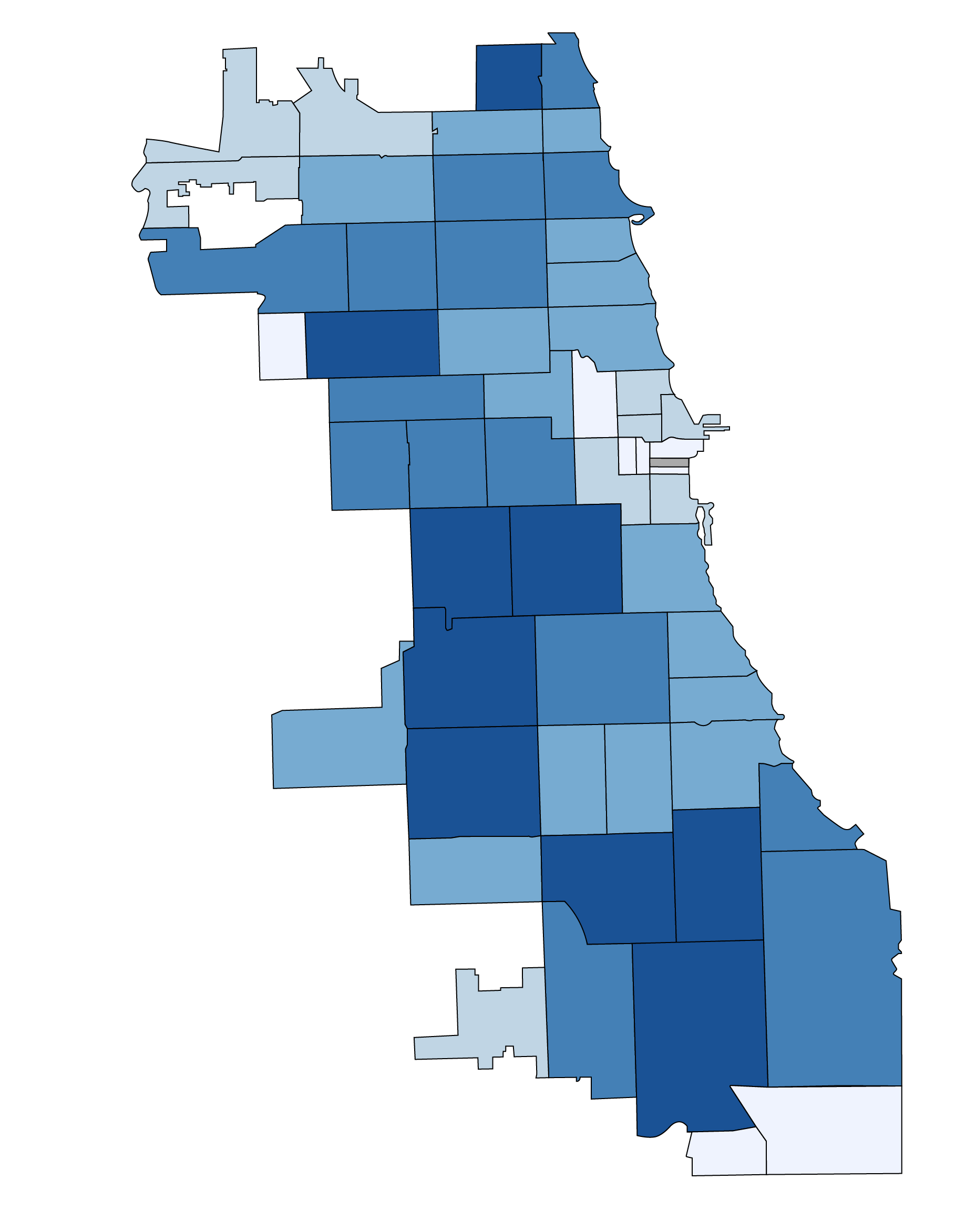
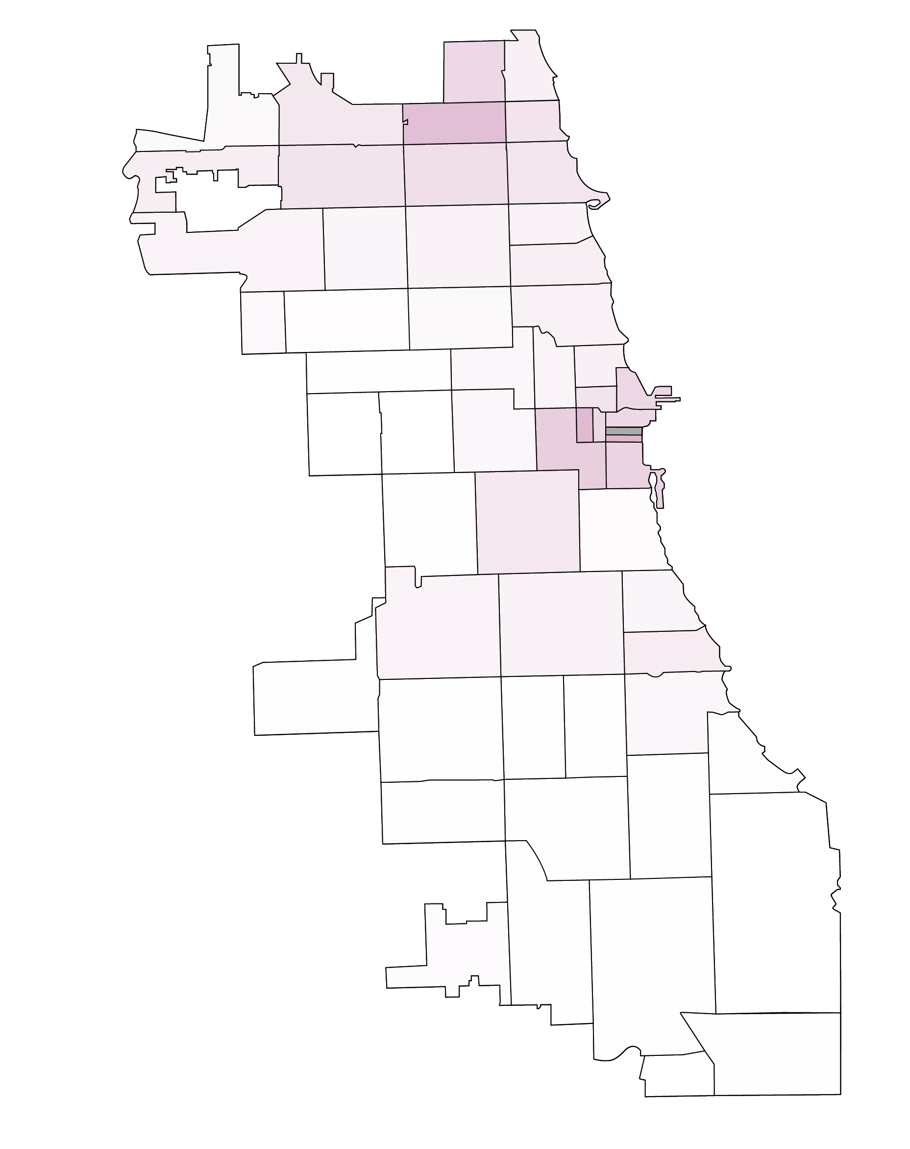
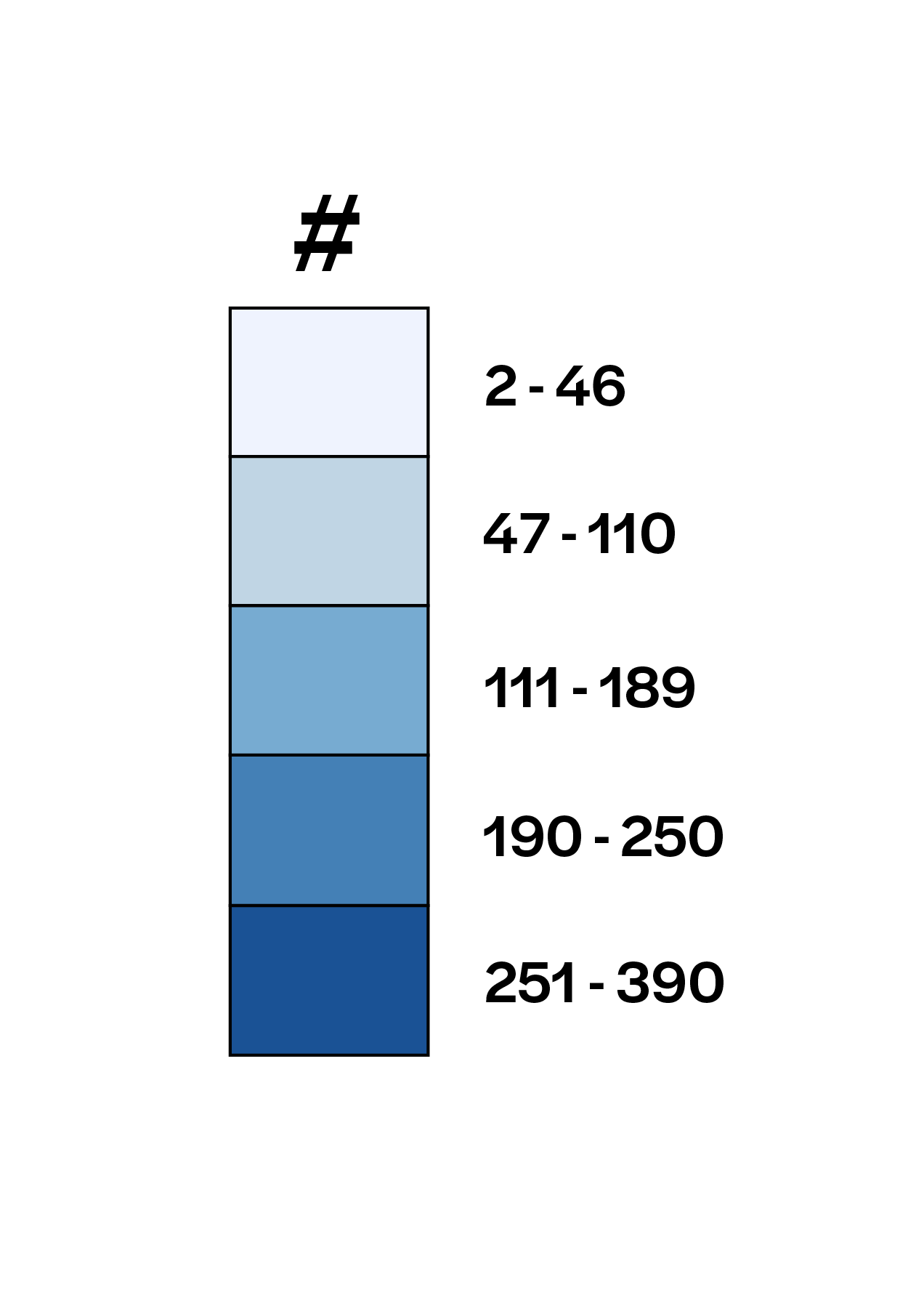
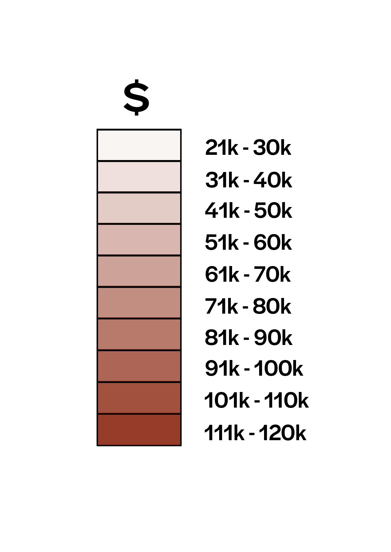
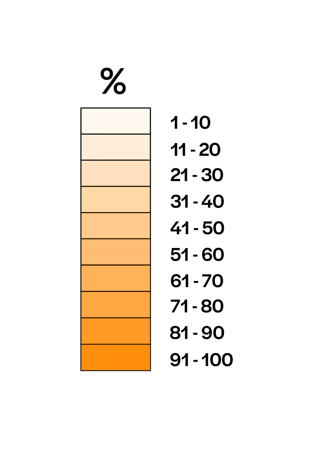
Every day, the City of Chicago releases updates on how COVID-19 has affected communities across the city. Along with data that break downs the number of cases by age, gender, and race, the city posts a daily map that shows how many confirmed cases are in each city zipcode.
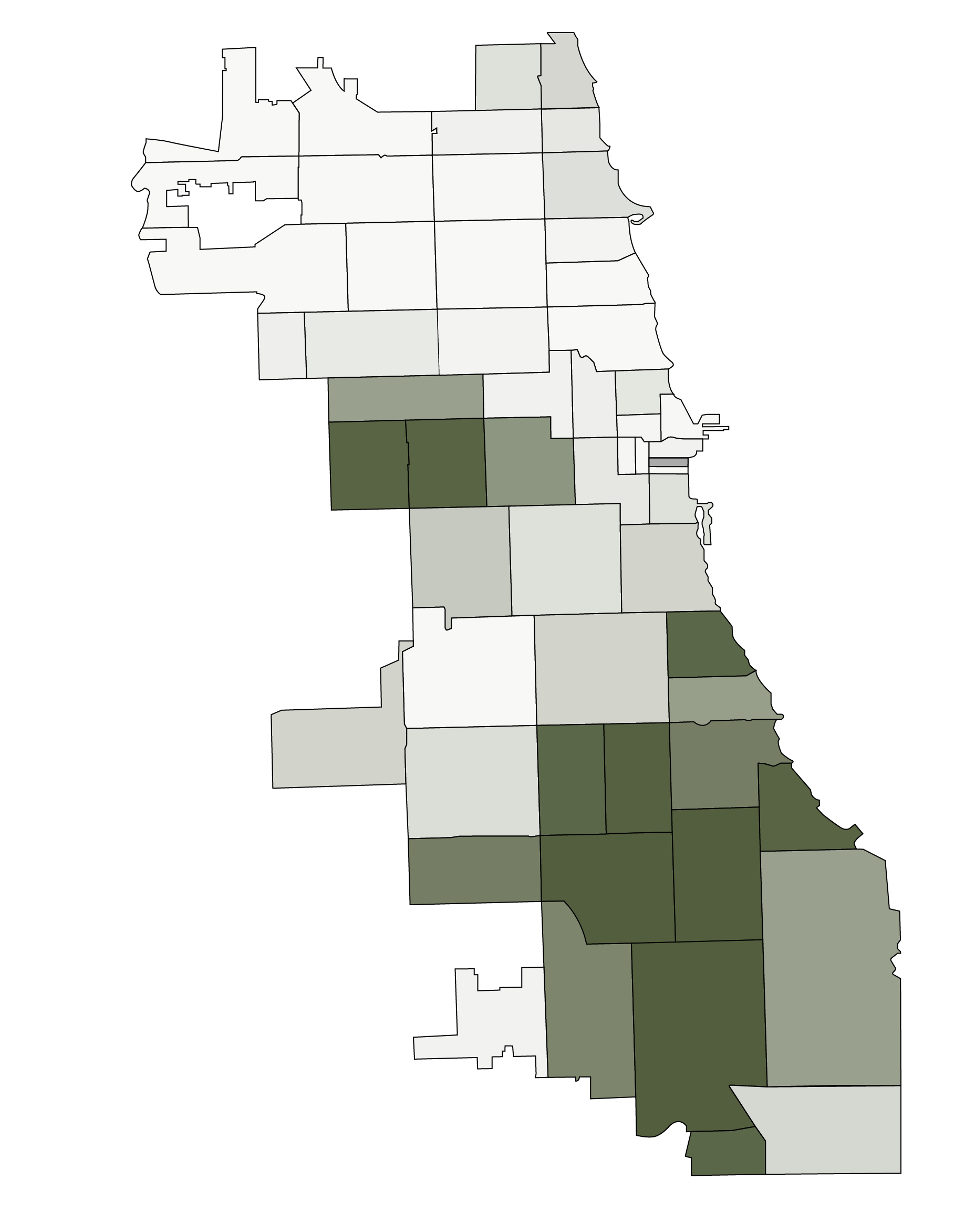
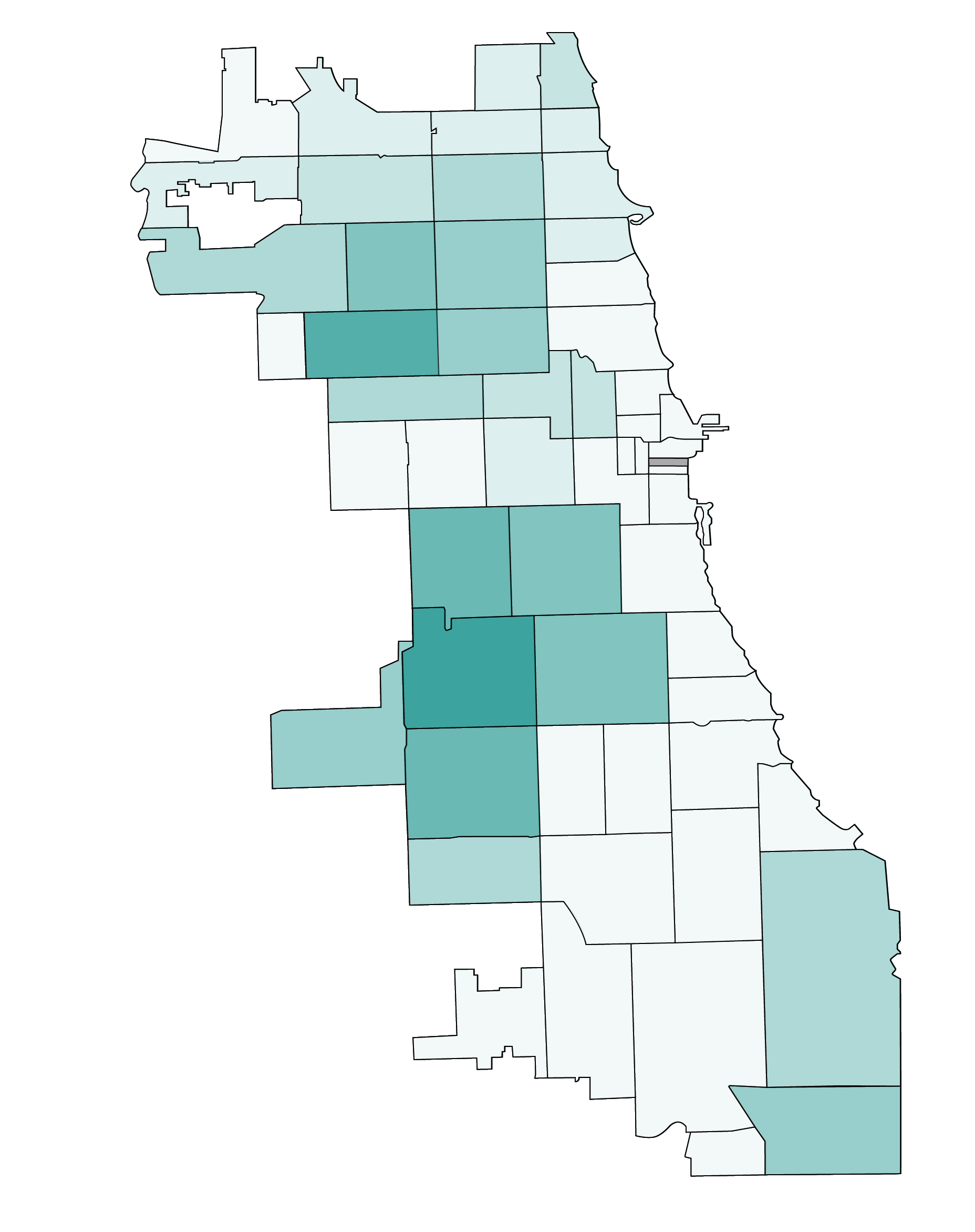
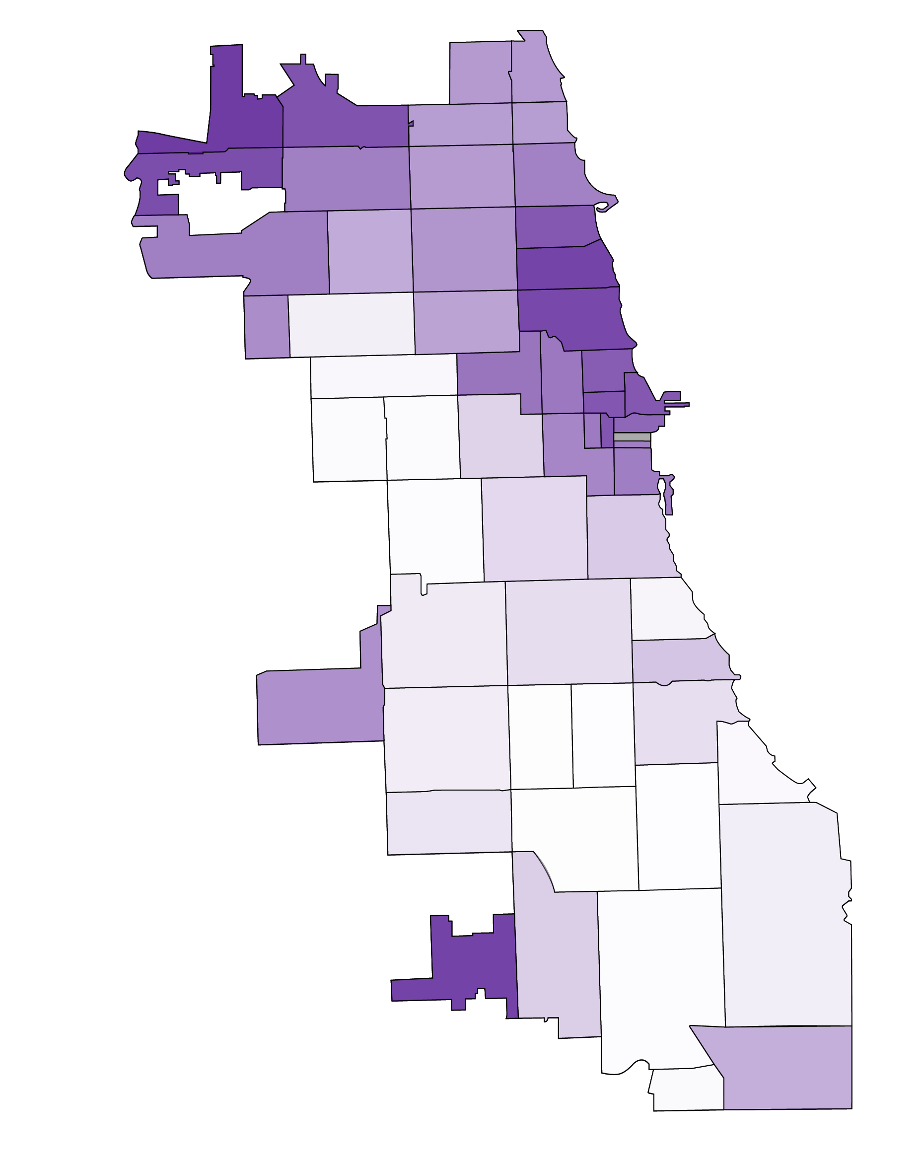
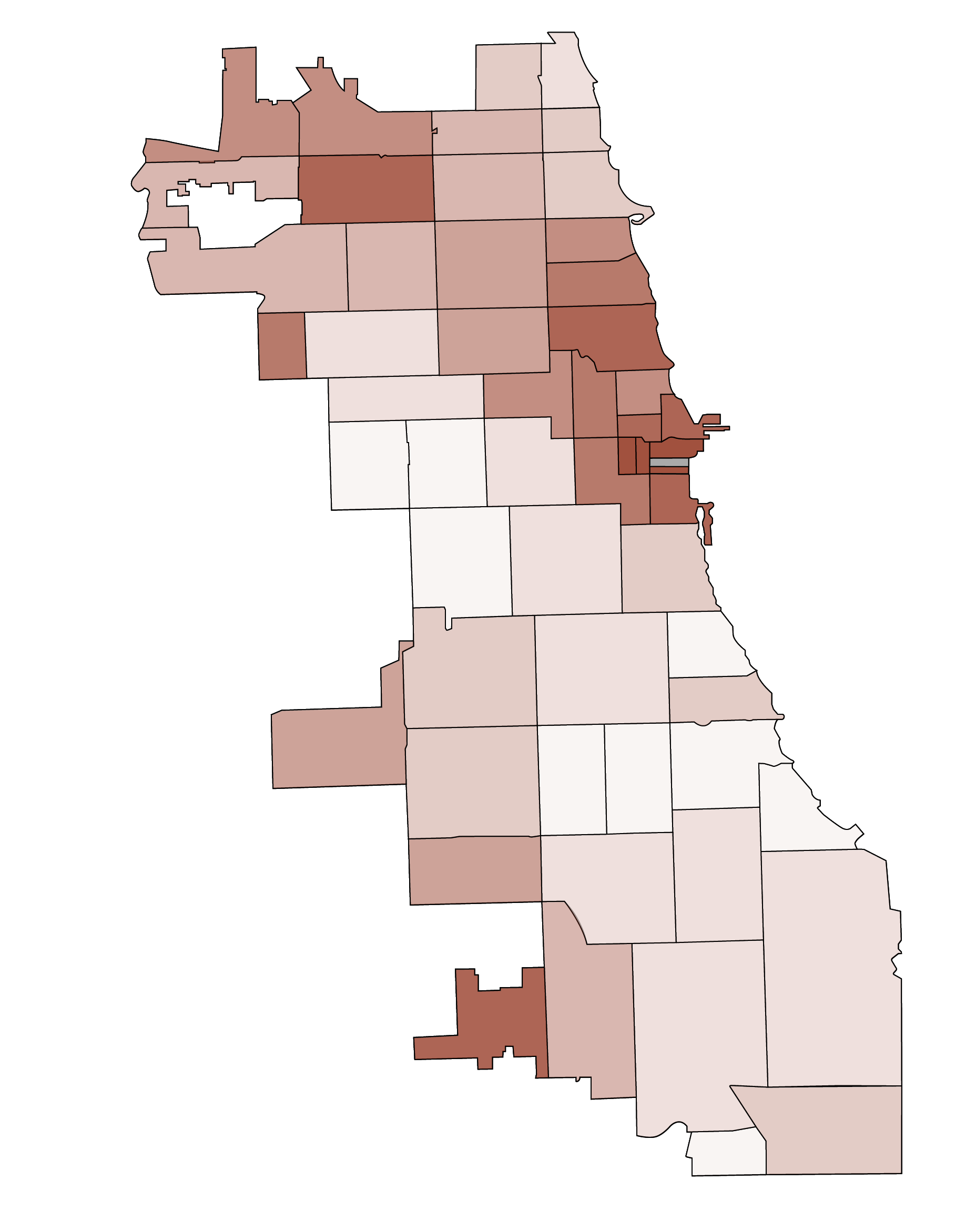
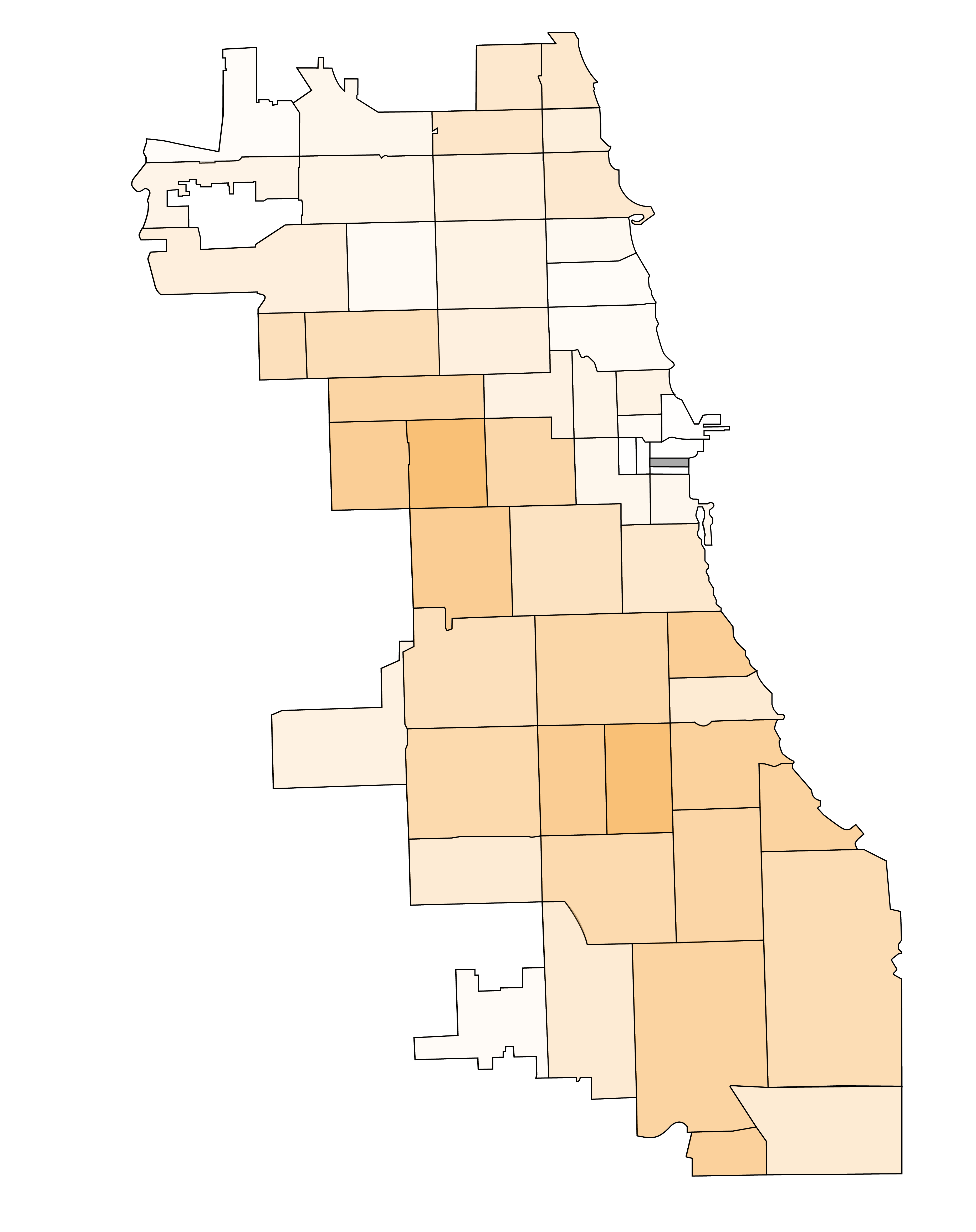
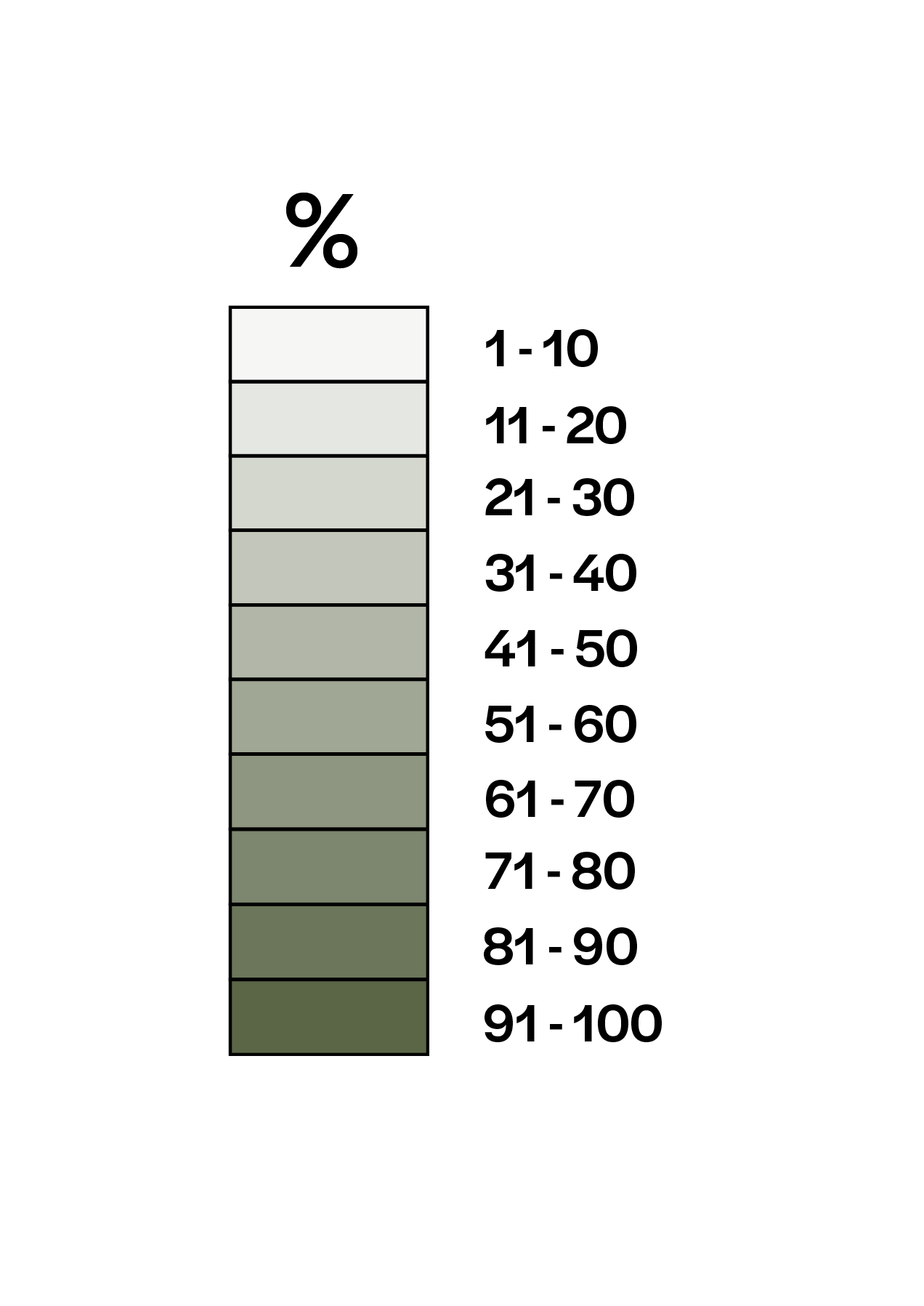
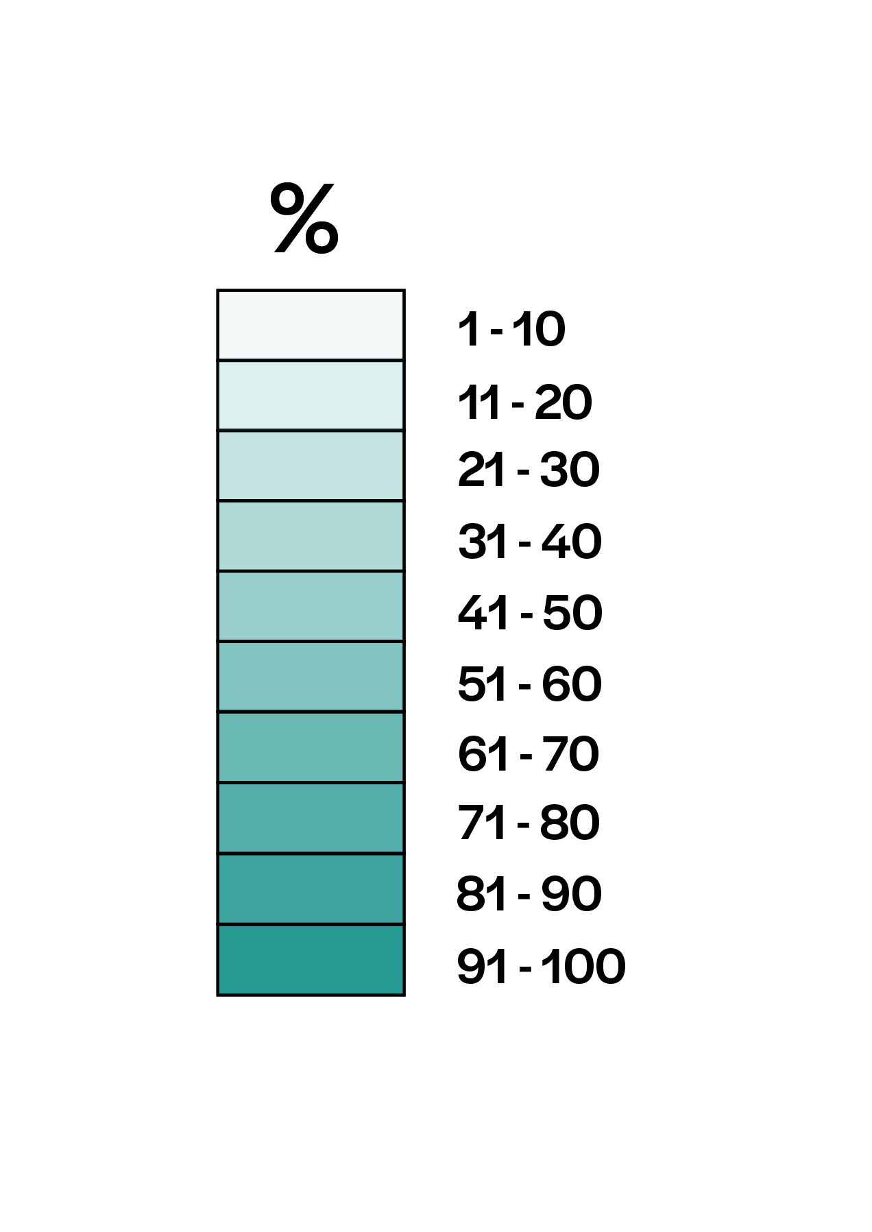
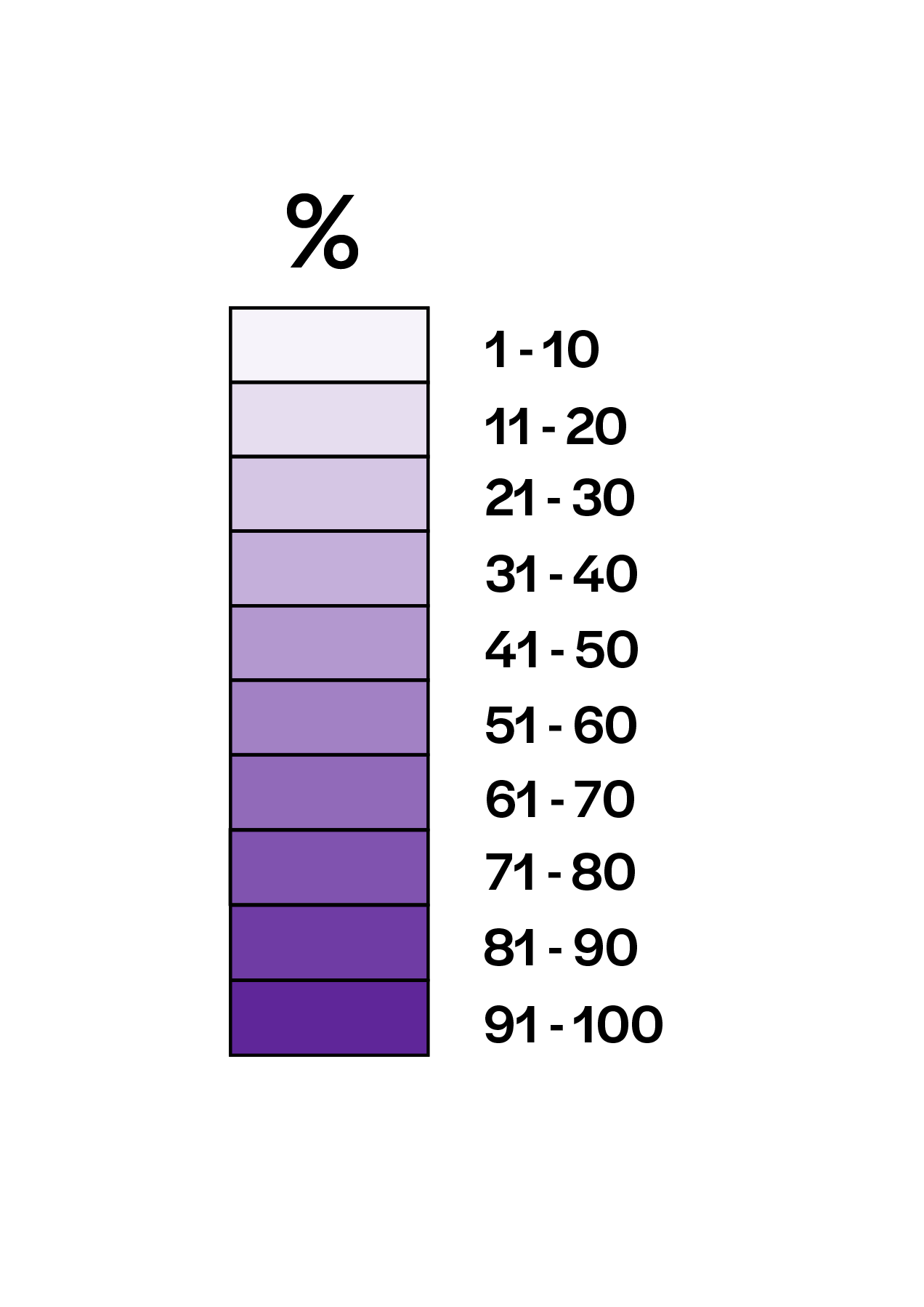
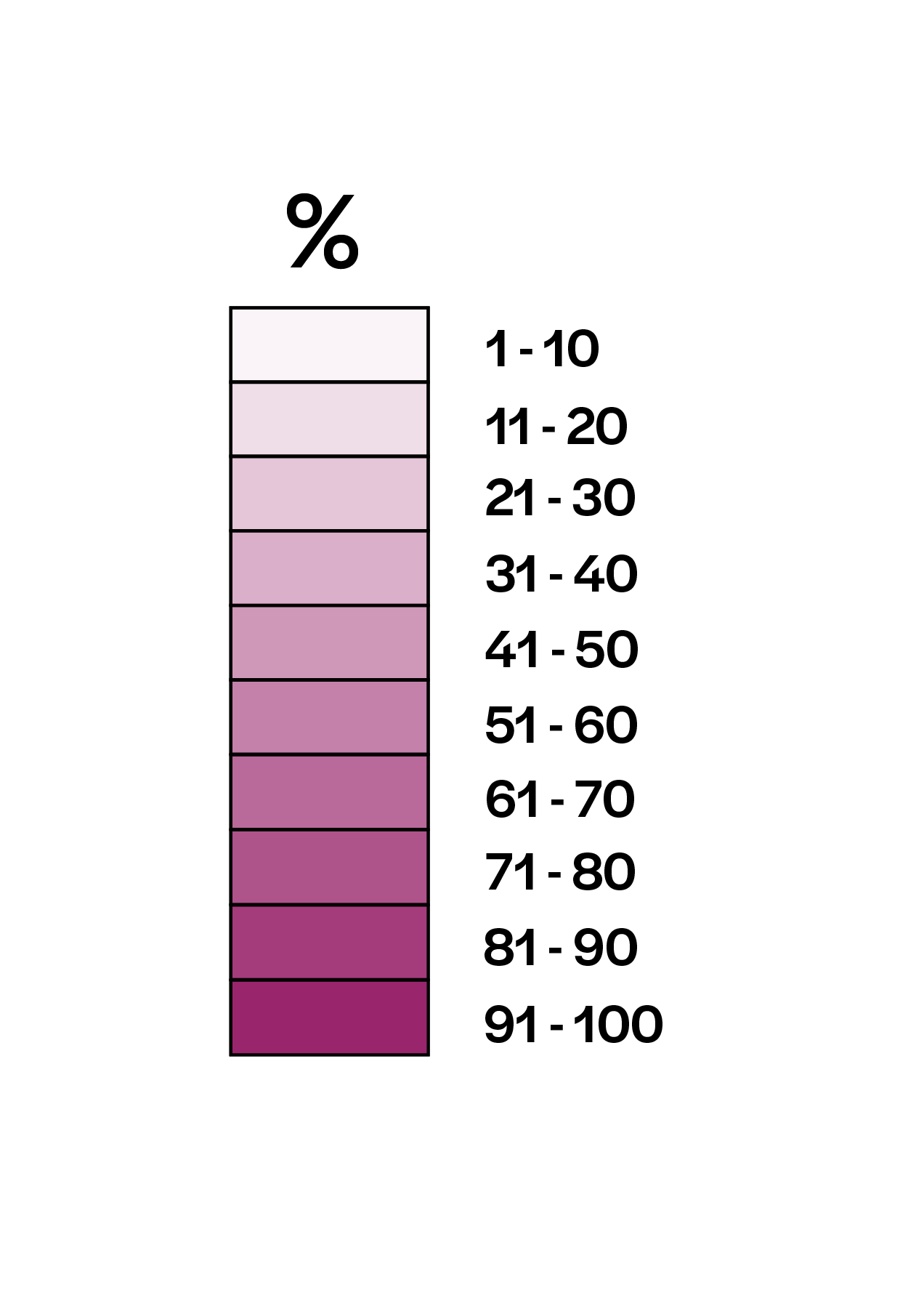
In this visualization, the Chicago COVID-19 zipcode map is put in context with additional maps that outline the overall racial and socioeconomic makeup of each zipcode in the city. Through comparing the maps, one can begin to see which communities have been most vulnerable to the COVID-19 pandemic.
Note: For the purpose of creating this visualization, the COVID-19 data was frozen on April 15, 2020.